
Apple certainly isn’t shy about experimenting with design, and at WWDC 2025, they unveiled their latest aesthetic venture: Liquid Glass. It’s a bold approach to user interface design that appears to seek both elegance and innovation. Yet, this shiny new update has not gone without scrutiny. As I delved deeper into the Liquid Glass design on my new iPhone 16 Pro running iOS 26, the experience has been a rollercoaster of emotions; a mix of excitement and discontent.
First Impressions: Shiny but Chaotic
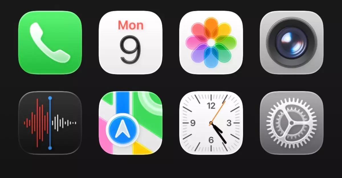
At first blush, the Liquid Glass design is undeniably captivating. The notion of app icons and interactive elements taking on a glassy, liquid appearance is visually striking. However, there lies an immediate flaw: the initial implementation feels somewhat cluttered. While the intent is to introduce a sense of depth by creating a floating effect over the background, it inadvertently creates chaos on the screen. The promise of enhanced interactivity and fluidity finds itself at odds with practical usability. Take the Control Center, for instance. It’s purportedly designed to be user-friendly, yet the overwhelming transparency makes it harder to read at a glance.
The aesthetic may exude sophistication, but its chaotic nature makes me ponder: is style compromising function?
A Closer Look: The Attention to Detail
Digging further into the Liquid Glass aesthetics, one can appreciate Apple’s signature dedication to detail. While the new rounded tab bar animation replicates the gentle movement of water droplets—an impressive technological feat—it can border on the distracting. What is meant to be elegant can sometimes feel cartoonish. Moreover, some functionality aspects, like toggling the alarm in the Clock app, have also been altered in a way that is visually intriguing yet functionally perplexing.
This raises a broader question: Are these innovations intended to streamline operations, or are they more focused on parading creativity? Finding the balance between the two is often where Apple has excelled, and this new direction may risk tipping that balance.
The Keyboard and Settings: A Space-Wasting Affair
The modification to the keyboard’s appearance also merits attention. While stylish, the overall spacing in the Settings app seems counterproductive, feeling excessively spread out. This kind of aesthetic formality can lead to user fatigue; we’re left scrolling mindlessly through features rather than engaging in a swift, seamless experience.
This is particularly disheartening considering that one of iOS’s historical strengths has been its intuitive nature. Many users appreciate a design that prioritizes efficiency over purely aesthetic goals, so a redesign that risks user engagement for style warrants critical examination.
Growth and Adaptation: The Silver Lining
It’s important to acknowledge that experiences with design updates can evolve over time. Initially, I found myself frustrated by Liquid Glass, yet, after multiple hours using the beta version, I could feel myself being charmed by its unique flair. The fluidity and the dynamic visual elements have a way of pulling users in, enticing them to explore. However, it still lacks the polish one would come to expect from Apple; the glaring inconsistencies are evident.
While these design changes are bold, they may require more fine-tuning before the final release in the fall. If Apple can address the myriad issues related to transparency, spacing, and overall usability, Liquid Glass could evolve from being a chaotic eye-catcher into a sophisticated interface that enhances user experience.
The Road Ahead: Optimism for Improvement
In the end, the introduction of Liquid Glass presents a tantalizing glimpse into what could be a more visually engaging future for Apple devices. However, that potential is currently marred by usability issues and visual chaos. As a long-time Apple fan, I remain cautiously optimistic, hopeful that the company will fine-tune these critical elements before the official rollout of iOS 26. After all, while it’s exhilarating to break the mold, it’s crucial that the fundamental user experience remains intact. The stakes are high, and time will tell whether Liquid Glass becomes a transformative innovation or a regrettable detour in Apple’s illustrious design journey.